Ta Da! I’ve just unveiled our new look, I hope you like it. Please do let me know what you think, leave a comment if you’d like. With the change, I was trying to make the site a little more readable, improve the navigation, and generally make the look a little more clean while creating some new opportunities for monetization.
There are a number of “new” things to look at. On the left hand navigation bar, you’ll notice we finally integrated search for web or this site. Directly beneath the search box is a new section, Featured Links. To the right of that are a few “button” images. These two sections are set aside for sponsors of this site. If you have need of or are interested in what they offer, check them out.
The Categories section has gone on a diet, I’ve consolidated down to the group you see to the left. If you hold your mouse over a category, it will give a short description of the contents. The Links section survives intact from our prior version, good resources and reading there, I encourage to explore them.
The Tools section is new, in addition to an About page (which existed in the old look), an Advertise Here page has been added to provide information about advertising, Archives, which organizes content by posting month/year and category now exists, and I’ve added an extensive section on the tools and technologies used to create this site and keep it up-to-date.
Below the Tools sections are Most Popular posts and Recent Posts and Comments sections. That’s a short tour, I hope that you’ll find our new look and feel not only easy on the eyes, but easier to navigate and read content. Thanks for dropping by!
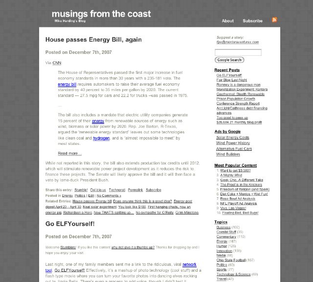
As a point of comparison, the image below is a screen shot of our “old” look:







FYI mike, for some reason all the sidebar sections after ‘Tools’ are rendering in a tiny tiny unreadable font. This is viewed on firefox (latest version) in XP.
Thanks Lloyd, I’ll look into it. Update: I saw the same thing you did and think that the font size is now consistent across the sidebar. At least it shows that way in every browser version/OS I have access to. Thanks for pointing that out.