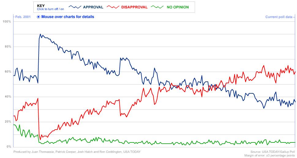
A colleague sent this link to me the other day and I thought it was pretty darned interesting. This chart below was taken from USA Today (a bastion of liberal media, yeah right) and shows the approval, disapproval, and no opinion lines of President Bush based on Gallup Polls. The real application at the website is “live” – meaning you can mouseover data points to get detail which is pretty cool.
Click to enlarge the image or visit the live site.

Not surprisingly, the trends track the event line of the past 6 years, though it is curious how there was a temporary crossover in approval just at election time in November, 2004. It would appear the more the “decider” decides, the less people approve of his decisions. Too bad there’s not a super-majority in Congress, this is a case where impeachment is actually merited. But that’s a pipe dream, we’ll have to wait for the next election to rid ourselves of the most corrupt and morally bankrupt administration in the history of the United States.
« Another indispensible air travel tool
» Save gas with small changes
Commentary
Bush Approval Trend
05.15.07 | Comment?
« Another indispensible air travel tool
» Save gas with small changes


