Instructive Chart
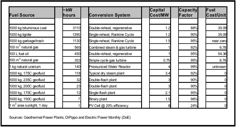
If ever you wanted to understand why the industry continues to develop coal plants, even though the negative impact is clear for all to understand, look at the chart above. You’ll notice that coal produces the most energy per unit, at a low cost per unit, and is relatively cheap from a capital cost perspective to build. With clean coal restrictions, the capital cost increases pretty radically (about 3x) but the energy output per unit and fuel cost still remain attractive.
A wind row ought to be added to this chart, but the standard unit was a little tricky to calculate. If anyone has good ideas about how to represent that aspect, please leave a comment.